How to craft a great e-newsletter
Whatever industry or organisation you’re creating email communications for, the content needs to be inspiring, informative and easily navigated. A great e-newsletter can help generate sales, entice readers to find out more and ultimately help achieve the sender's goals - a bad strategy or design can result in loss of customers. So, how can you stand out from the hoards of unread marketing campaigns in your customer’s inbox?
Subject line
The subject line is the first thing your reader will see when they hop onto their mailbox. You could spend hours creating a killer email, but it’s all for nothing if your subscribers aren’t enticed to even click on the message. You need to show your readers that your email has value for them and is the one they should spend their time scrolling through.
Links, buttons and calls to action
The goal of a newsletter is usually to encourage subscribers to read more, direct them to a website or get in touch with you. You need to ensure this process is as simple as possible. For example, creating an obvious button labelled ‘Lean More’ is much easier for readers to see and click on than a long URL (plus it looks much better too!). Calls to action need to be clear and take users to where they need to go, reducing the click-through rate of them getting the information they’re seeking.
Optimisation
So, you’ve designed a beautiful and informative email and you’ve hit ‘send’ then find that your email isn’t readable on mobile. According to Statistica, in the second quarter of 2022, mobile devices (excluding tablets) generated 58.99% of global website traffic and 2019 HubSpot research found that the majority (41%) of email views come from mobile devices. A failed mobile-view of your campaign therefore can affect a huge percentage of your database.
Length
No one wants to scroll through extensive wordy paragraphs. Creating a newsletter with headings, blurbs and buttons to read more will mean subscribers are likely to see more content within your newsletter. Adding a ‘read more’ button after a brief introduction to a subject will also drive traffic to your website, which can result in them sticking around and browsing through more of your content online.
Frequency
When deciding on your email marketing strategy, consider how often you’ll be creating sendouts. Some organisations may need to send an email every few days, whilst others might be suited to a monthly update. Consistency is key here, as well as ensuring you’re not irritating your customers by bombarding them with frequent, stale content.
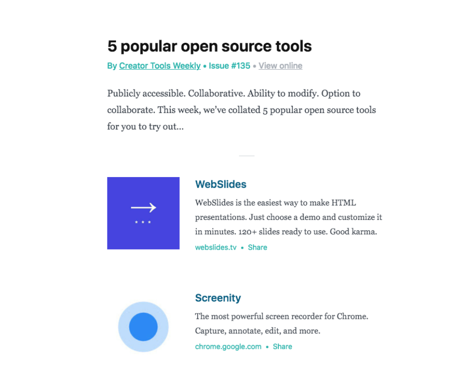
Speaking of newsletters, if you’re looking for creative new tools, apps and software sent straight to your inbox every Thursday, sign up to our Creator Tools Weekly newsletter here! For years, we created our newsletters with Revue, but unfortunately the site was discontinued last week (it was owned by Twitter!), so we’re now trying out Beehiiv!


